5 The Standard Approach for One Independent Variable
In this chapter, we will introduce the standard statistical approach for analysing experimental data with one independent variable (i.e., one factor). The simplest example of this is a study comparing the effect of two experimental conditions on one dependent variable. We will exemplify the standard approach for this design using a straightforward experiment.
5.1 Example Data: Note Taking Experiment
Heather Urry and 87 of her undergraduate and graduate students (Urry et al. 2021) (yes, all 87 students are co-authors!) compared the effectiveness of taking notes on a laptop versus longhand (using pen and paper) for learning from lectures. 142 participants (who differed from the 88 authors) first viewed one of several 15-minute lectures (TED talks) during which they were asked to take notes either on a laptop or with pen and paper. As this was a proper experiment, participants were randomly assigned to either the laptop (\(N = 68\)) or longhand condition (\(N = 74\)). After a 30-minute delay, participants were quizzed on the content of the lecture. The answers from each participant were then independently rated by several raters (who agreed very strongly with each other; we say that they showed high inter-rater reliability). This procedure produced one memory score per participant representing the percentage of information remembered ranging from 0 (= no memory) to 100 (= perfect memory).44 Figure 5.1 below shows the memory scores across both note taking conditions.
Note: The code below is only included for advanced readers or general interest. Understanding the code is not necessary for understanding the content of the chapter.
library("tidyverse")
library("afex")
library("ggbeeswarm")  ## only needed later, but already loaded here
theme_set(theme_bw(base_size = 15) +
            theme(legend.position="bottom",
                  panel.grid.major.x = element_blank()))
data("laptop_urry", package = "afex")
set.seed(1234566) ## needed to ensure jitter is the same each time plot is created
p1 <- ggplot(laptop_urry, aes(x = condition, y = overall)) +
  geom_violin(draw_quantiles = c(0.25, 0.5, 0.75)) +
  ggbeeswarm::geom_quasirandom() +
  stat_summary(colour = "red") +
  coord_cartesian(ylim = c(0, 100)) +
  labs(y = "memory score")
#> Warning: The `draw_quantiles` argument of `geom_violin()` is
#> deprecated as of ggplot2 4.0.0.
#> ℹ Please use the `quantiles.linetype` argument instead.
#> This warning is displayed once every 8 hours.
#> Call `lifecycle::last_lifecycle_warnings()` to see where
#> this warning was generated.
# to show figure execute (without comment):
# p1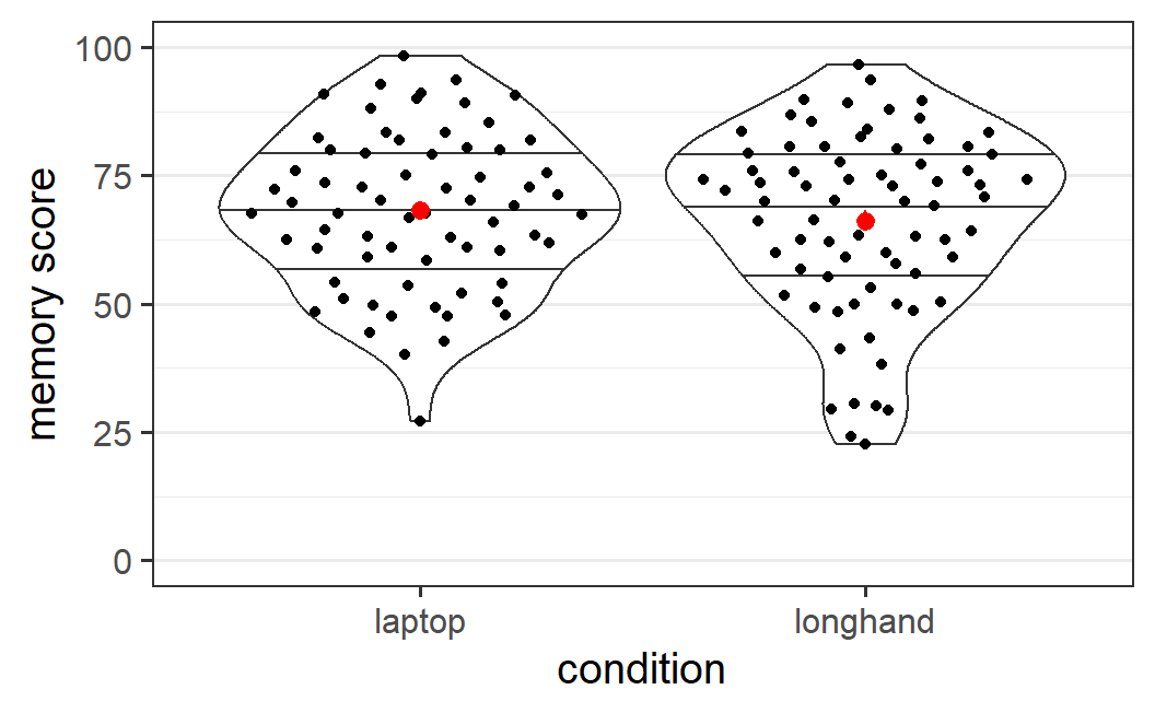
Figure 5.1: Distribution of memory scores from Urry et al. (2021) across the two note taking conditions. Figure details are described in the text.
In Figure 5.1, each black point shows the memory score of one participant so the full distribution of the data is visible. The shape of the distribution is also shown via a violin plot (the black outline around the points) to which we have added three lines representing three summary statistics of the data. From top to bottom these lines are the 75% quantile, the 50% quantile (i.e., the median), and the 25% quantile. The red points show the mean and the (barely visible) associated error bars show the standard error of the mean45. We see that the two means are quite similar, although the mean in the laptop condition is slightly larger, by 2.0 points (mean laptop = 68.2, mean longhand = 66.2).
5.2 Generalising From Sample to Population
The previous paragraph provides us with descriptive statistics describing the results in the experiment by Urry et al. (2021): There is a memory difference of 2.0 points on the scale from 0 to 100 between the laptop and the longhand condition for the sample of 142 participants. However, as researchers, we are usually not primarily interested in what happens in our sample. What we would like to know is if our results generalise to the population from which this sample is drawn.
Let's clarify what we mean with "population" and "sample", as these are two key concepts in statistics, even though this discussion will lead us on a bit of a tangent. One way of thinking about these terms is that the population encompasses all individuals that could in principle take part in the study whereas the sample are the particular individuals for which we have data. In this sense, the population are all potential participants whereas the sample are the actual participants of a study. Consequently, the sample is always a subset of the population; we say the sample is drawn from the population.
In the case of Urry et al. (2021), we should probably understand the population as undergraduate students from Tufts University, a research intensive (so-called R1) US university. This is the technically appropriate definition as all participants were drawn from the pool of Tufts University undergraduates. The problem with this understanding of population is that any possible generalisation of the results is limited. As researchers, we are not really interested whether the memory difference between note taking with laptop versus longhand only holds for Tufts undergraduates, but whether it holds for students in general.
The population we are actually interested in is all students, including students at very different institutions (e.g., students at universities in non-Western countries) and future students that might take notes either in longhand format or with a laptop (even students not yet born). Ideally, we hope that our results will generalise to this larger population of students. Obviously, undergraduates from Tufts are a subset of this larger population, yet there still remains the question about the extent to which results from them would be similar to results in the larger group. Whether or not this generalisation is permitted is not a statistical question, but a question of external validity (see Section 2.5.3). It depends on how representative Tufts undergraduates are with respect to our research question for the overall population of students. If, for example, there is something special about how Tufts students take notes or remember information (or about students on the US east coast, or students at R1 US Universities, or ...), then our generalisation would only hold for this sub-population of students, and not all students. To stay within the terminology introduced in this book, the question is whether there are plausible alternative explanations preventing us from generalising from one population to the other.
To sum up, the statistical methods introduced below only permit the generalisation from the sample to the actual population from which the sample is drawn. If our sample are only undergraduate students from a specific institution (as is commonly the case), then strictly speaking the statistical methods only permit us to generalise to the population of students from that institution.46 Whether we can generalise to the larger population we are usually interested in (e.g., all students or all humans), is not a question statistical methods can answer. This can be seen as yet another epistemic gap that needs to be bridged using non-statistical arguments. One way to make a convincing case that a finding generalises to the larger population is to collect data from a larger population and show that it does generalise to that population. For example, instead of only collecting data from Western undergraduate students, we could attempt to collect data from students from other parts of the world.
Interestingly, a recent large-scale analysis replicating (i.e., repeating) 28 classical psychological phenomena across 36 countries and territories found that overall differences between countries and cultures were surprisingly small for the specific phenomena investigated, with few exceptions (Klein et al. 2018). One caveat with this study was that even though the participants came from many different parts of the world, most were still undergraduate students. Nevertheless, this study provides some assurances that many phenomena studied in psychology at least generalise from undergraduate populations at specific institutions to undergraduate populations world wide. Of course, whether this also holds for the research question investigated by Urry et al. (2021) cannot be conclusively answered, as it was not one of the phenomena investigated by Klein et al. (2018).
5.3 The Logic of Inferential Statistics
Going beyond the the present sample is the goal of inferential statistics. There are different inferential statistical approaches, and we are focussing on the most popular one, null hypothesis significance testing (NHST). We will describe NHST more thoroughly in a later chapter, but will introduce its main ideas here. For NHST, the question of generalising from sample to population for the particular study we are discussing here, is about two different possible true states of the world: There either is no true difference in condition means in the population -- in which case the mean difference observed in our sample is due to chance -- or there is a true difference in the condition means in the population.
In the study by Urry et al. (2021), the two possible true states refer to the difference in memory scores between students that take notes with a laptop or in longhand in the population of students. One possibility is that there is no difference in memory scores between the two note-taking conditions. In this case, the observed difference of 2.0 points is just a chance occurrence (i.e., noise). The other possibility is that there is a true difference in memory scores depending how students take notes. In that case, the observed difference of 2.0 is not only due to chance, but also affected by the true difference in the population (i.e., signal plus noise).
Before going forward and describing how we test between these two possible true states of the world, it is important to understand the importance of distinguishing between the difference in the sample and the difference in the population. In reality, practically every study shows some difference between any two conditions. It is extremely unlikely that the observed difference is exactly 0. For example, in the case of Urry et al. (2021), even though the distributions of memory scores look very similar (5.1), we still have an observed difference of 2.0 points. It seems unlikely that with two groups of different participants, the mean scores would be exactly the same in both conditions, even if the type of note taking had no true effect. In other words, just because we have a difference in the sample does not mean this generalises to the population. We need inferential statistics to help us with this decision.
To decide between the two possible true states of the world, we set up a statistical model for the data. This statistical model allows us to assess if there is no difference between condition means in the population -- we call this possible true state of the world the null hypothesis. Keep in mind that "null" here just means non-existent. More specifically, the statistical model allows us to test how compatible the observed data is with the null hypothesis of no difference, which proceeds as follows:
- We assume that the null hypothesis is true, which is to say that there really is no difference in the population means.
- Based on this assumption, we calculate how likely it is to observe a difference at least as large as the one we have observed in our sample. This is done by comparing the observed level of noise with the observed difference between conditions.
- If the observed difference is small given the observed level of noise, the observed data is compatible with the null hypothesis of no true difference in the population means.
- If the observed difference is large given the observed level of noise, it is unlikely that there is no true difference in the population means.
- If the probability of observing a difference at least as large as the one we have observed is very small, we take this as evidence that the null hypothesis of no difference is not true -- we reject the null hypothesis.
- When we reject the null hypothesis, we (tentatively) behave as if there is a difference in the population means. In this case, it is common to say that the experimental manipulation has an effect.
As you can see, the logic underlying inferential statistics using NHST is not trivial. To make it clearer, let us apply the logic to the example data. We want to know whether the observed mean memory difference between note taking with a laptop and note taking in long hand in our sample generalises to the population of students that take notes in either of these ways. To do so, we set up a statistical model for our data. This model allows us to test how compatible our data is with the null hypothesis that there is no mean memory difference in the population means. This is done by comparing the overall noise in the data (i.e., the variability visible in Figure 5.1) to the observed difference between conditions.
Specifically, the model allows us to calculate the probability of obtaining a memory difference as large as the one we have observed assuming that there is no mean memory difference in the population. If our data is incompatible with the null hypothesis -- that is, it is unlikely to obtain a memory difference at least as large as the one we have observed if the null hypothesis were true -- we reject the null hypothesis of no mean memory difference. Because we reject the null hypothesis, we then tentatively behave as if there was a mean memory difference in the population. In other words, we behave as if the type of note taking had an effect on memory after lectures in the population.
Even though the logic of NHST is not necessarily intuitive, it is clearly helpful for researchers. After running an experiment, we want to know if the difference observed in our experiment (i.e., in our sample) is meaningful in the sense that it generalises to the population from which we have drawn our sample. As said above, in almost every actual experiment, there is some mean difference between the conditions (i.e., it is extremely unlikely that both conditions have exactly the same mean). Thus, we pretty much always face this question. NHST allows us to test whether the observed difference is compatible with a world in which there is no difference. If this is unlikely, we decide -- that is, we behave as if -- there was a difference.
What we can see from spelling out the logic in detail is that there are a few inferential steps we have to make to decide whether we can generalise from sample to population. We design experiments with the goal in mind of finding a mean difference between the experimental conditions. However, we then do not test this directly. Instead, we test the compatibility of the data with the opposite of what we are actually interested in -- the null hypothesis of no effect. If this test "fails" -- that is, the test suggests that the data is incompatible with the null hypothesis -- we then make two inferential steps. First we reject the null hypothesis and then we behave as if there is a difference.
Both of these inferential steps are not necessitated logically. The only number we get from NHST is a probability indicating how unlikely the observed data is under the null hypothesis of no difference. If this probability is low, that does not necessarily mean that the null hypothesis is false. Low probability events can happen. Furthermore, the statistical model representing the null hypothesis can also be false in ways that do not necessarily mean that there is a difference between conditions. Therefore, as we have already discussed when discussing the second inferential gap (Section 1.3.2), inferences based on NHST never provide 100% certainty.
NHST is the de facto standard procedure for inferential statistics across empirical sciences, not only in psychology and related disciplines. Understanding the logic of NHST will enable you to understand the majority of empirical papers and will also allow you to apply inferential statistics in your own research. Nevertheless, there exist a long list of popular criticisms of NHST (e.g., Rozeboom 1960; Meehl 1978; Cohen 1994; Nickerson 2000; Wagenmakers 2007). Despite these criticisms, NHST is (and will likely remain) the most popular statistical framework. The reason for this is that all alternative approaches (such as the Bayesian approach; Wagenmakers et al. (2017)) also have issues complicating their use in practice.
We will discuss the criticisms of NHST in more detail in later chapters, but for now it is important to realise that NHST does not allow us prove whether there is a mean difference in the population. The only thing NHST calculates is the probability of how compatible the data is with the null hypothesis. If this probability is low that does not necessarily mean that there is a difference. Likewise, if this probability is high that does not necessarily mean there is no difference. All inferences we draw based on NHST results are probabilistic in themselves (i.e., they may be true or false). So the most important rule when interpreting the results from NHST is to be humble. NHST never "proves" or "confirms" anything. Instead, NHST results "suggest" or "indicate" certain interpretations. If we do not over-interpret results, but instead stay humble in our interpretations, we are unlikely to fall prey to the common (and often justifiable) criticisms of the NHST framework.
5.4 The Basic Statistical Model
To apply inferential statistics in the NHST framework to our data, we begin by setting up a statistical model for the data. (IV). Here, this means predicting our observed outcome, the DV, from the experimental manipulation, the IV.47
The basic statistical model partitions the observed DV into three parts: the overall mean, which for reasons that will become clear later is called the intercept, the effect of the IV, and the part of the data that cannot be explained by the model, the residuals, which represent the noise. When summing these three parts together, they result in the observed value. In mathematical form, we can express this as
\[\begin{equation} \text{DV} = \underbrace{\text{intercept}}_{\text{overall mean}} + \text{IV-effect} + \text{residual}. \tag{5.1} \end{equation}\](For those not used to reading mathematical expressions, the full stop at the end of the equation simply ends it and has no mathematical meaning.) As someone without a mathematics background myself, I know that equations are often more intimidating than immediately useful. Consequently, it makes sense to go through this equation in more detail to ensure you fully understand it. All statistical analyses discussed in this book are applications of Equation (5.1). As this equation forms the foundation for the statistical analysis of experimental data, understanding it will help to unlock the mysteries of all the analyses discussed in this book.
Let's consider the variables in Equation (5.1) in more detail. When doing so, we also consider how many different possible values each variable can take.48 The following figure, a variant of Figure 5.1, shows the elements graphically, which are explained in the text just below.
Note: The code below is only included for advanced readers or general interest. Understanding the code is not necessary for understanding the content of the chapter.
set.seed(1234566)  ## needed to ensure jittered points are at same position
p1_de <- ggplot_build(p1)
#> No summary function supplied, defaulting to
#> `mean_se()`

lap2 <- laptop_urry %>%
  mutate(xpoint = p1_de$data[[2]]$x)

lap3 <- laptop_urry %>%
  group_by(condition) %>%
  summarise(overall = mean(overall))

lap4 <- lap3 %>%
  summarise(overall = mean(overall))

lap5 <- p1_de$data[[1]] %>%
  group_by(x) %>%
  summarise(xmin = first(xmin),
            xmax = first(xmax)) %>%
  bind_cols(lap3)

lap6 <- p1_de$data[[2]] %>%
  group_by(group) %>%
  mutate(overall = mean(y)) %>%
  as_tibble() %>%
  select(-size, - fill, -alpha, - stroke)

set.seed(1234566)
p2 <- ggplot(laptop_urry, aes(x = condition, y = overall)) +
  geom_violin() +
  geom_segment(data = lap6,
               mapping = aes(x = x, xend = x, y = overall, yend = y),
               colour = "grey") +
  ggbeeswarm::geom_quasirandom() +
  geom_hline(yintercept = lap4$overall, linetype = 3, colour = "blue") +
  geom_segment(data = lap5, mapping = aes(x = xmin, xend = xmax,
                                          y = overall, yend = overall),
               colour = "red", linetype = 2) +
  stat_summary(colour = "red") +
  labs(y = "memory score")
# to show figure execute (without comment):
# p2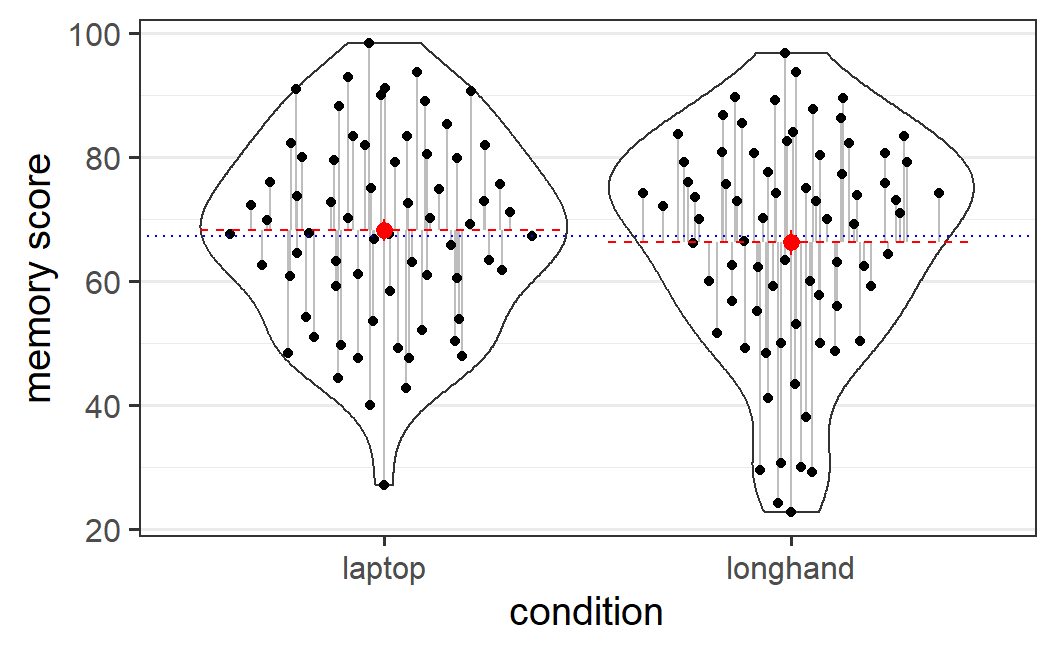
Figure 5.2: Data from Urry et al. (2021) showing the overall mean (the intercept, drawn as a blue dotted line), the condition-specific effects (the difference between the dashed red lines for the condition means and the blue line), and the residuals (the grey lines from the condition means to each data point).
\(\text{DV}\): The dependent variable, DV, consists of the observed values, one for each observation/participant. For the example data, these are the 142 black data points shown in Figure 5.2. Thus, our statistical model tries to explain the individually observed values.
\(\text{intercept}\): The single intercept represents the overall mean. Consequently, it is the same for each observation. In experimental designs, we define this as the mean of all the condition means. For the example here, the intercept is the average of the laptop mean (68.2) and the longhand mean (66.2), (68.2 + 66.2) / 2 = 67.2, and is shown as a blue dotted line in Figure 5.2.
\(\text{IV-effect}\): The IV-effect represents the signal, the effect of our independent variable, defined as the difference between the condition means and the intercept (also referred to as the deviation of the condition means from the intercept). Thus, we always have as many different IV-effects as we have conditions. For the example here, with only two conditions, we only have two IV-effects, both of which have the same magnitude and only differ in sign: 1.0 for the laptop condition (68.2 - 67.2 = 1.0) and -1.0 for the longhand condition (66.2 - 67.2 = -1.0). If we add these values to the intercept, we get the condition means. As we will discuss further below, the IV-effect is the most relevant part of Equation (5.1) for answering the statistical question of interest. In Figure 5.2, the red dashed lines (and the red points) show the condition means; thus the condition effects are the differences between the blue line and the red lines.
\(\text{residual}\): The residuals are the idiosyncratic aspects of the data that are left unexplained by the statistical model, in other words, the noise in the data. As the model only predicts the condition means (the intercepts plus independent variable), these are the deviations (or differences) of the individual observations from the condition means. Thus, as for the DV, we have as many residuals as we have values of the DV. In Figure 5.2, the residuals are shown as grey lines from the condition means to each data point. This is all the information (or variability in the data) our model cannot explain. As we have discussed before, the observed level of noise -- which is a function of the size of the residuals and the number of observations -- is an important quantity when applying NHST.
5.4.1 Model Predictions
A simplification of Equation (5.1) which makes it clearer what the statistical model predicts, is obtained if we ignore the residuals for a moment. Remember, the residuals are the part of the data that remains unexplained and represent the noise -- all the idiosyncratic parts of the data independent of our manipulation. For example, some participants will have better memory than others, independent of how they took notes.
If we ignore all idiosyncratic aspects, what remains from our statistical model are only the predictions based on our IV, here the experimental condition. Thus, what a statistical model actually predicts is the means of the experimental conditions. We can again formalise this as
\[\begin{equation} \hat{\text{DV}} = \text{intercept} + \text{IV-effect}. \tag{5.2} \end{equation}\]Here, the hat symbol (\(\hat{}\)) means predicted value. Thus, in contrast to the actually observed DV in Equation (5.1), we only have the predicted DV in this equation.
When performing statistical analyses, it sometimes can be helpful to remind oneself that an ordinary statistical model only predicts the condition means. We generally do not make predictions about individual participants or consider other factors that are not part of the model.
5.4.2 Statistical Model for the Example Data
Let's take a look at the first six participants and their values for all the variables in the basic statistical model to get a better understanding of Equation (5.1).
| pid | condition | overall | intercept | iv_effect | prediction | residual |
|---|---|---|---|---|---|---|
| 1 | laptop | 65.8 | 67.2 | 1 | 68.2 | -2.4 |
| 2 | longhand | 75.8 | 67.2 | -1 | 66.2 | 9.6 |
| 4 | longhand | 50.0 | 67.2 | -1 | 66.2 | -16.2 |
| 5 | laptop | 89.0 | 67.2 | 1 | 68.2 | 20.8 |
| 6 | longhand | 75.6 | 67.2 | -1 | 66.2 | 9.4 |
| 8 | longhand | 83.3 | 67.2 | -1 | 66.2 | 17.1 |
The first three columns show the data. pid is the participant identifier (id) column. As it is often the case for real data, some ids are missing for various reasons (here 3 and 7). For example, it can happen that potential participants were interested in the study and received an id, but then did not finish or start the experiment. As a consequence, the first 6 rows already go up to pid = 8. condition is the factor (categorical variable) that tells us the note taking condition for each participant. overall is their memory score on the scale from 0 to 100 which serves as the numeric DV in the statistical model (the left-hand side in Equation (5.1)).
The intercept, the iv_effect, and the residual columns contain the values of the variables on the right-hand side of Equation (5.1). In addition, the prediction column shows the left-hand side of Equation (5.2).
As described above, every observation (i.e., each row) has an idiosyncratic DV and residual. We also see that all values share one intercept, and the IV-effect is condition specific. As a consequence, the prediction column (which is the sum of intercept and IV-effect) also has only two different values, one for each condition.
We can see in this data that the sum of the three values on the right-hand side of Equation (5.1) equals the observed value of the DV. For example, consider pid = 4. If we enter the values into Equation (5.1) we have
\[ 50.0 = 67.2 + (-1) + (-16.2). \]
From this example, we can also better understand what the residuals mean: the difference between the observed value and the predicted value, \(\text{residual} = \text{DV} - \hat{\text{DV}}\). Consider again pid = 4. For this participant we have a residual of
\[ -16.2 = 50.0 - 66.2. \]
We can also see how the residual captures the idiosyncratic aspects of our data that cannot be explained by the condition means. For example, some participants -- such as pid = 5 and pid = 8 -- have large positive residuals indicating that they have good memory independent of their note taking condition. Likewise, pid = 4 has a large negative residual, indicating comparatively worse memory (again independent of the note taking condition). In other words, one part of the unexplained information in the data in the standard statistical model are individual differences.
5.4.3 Understanding the Statistical Model
Now that we have described the parts of the statistical model, we are almost ready to fit the model and interpret the output. Before doing so, it makes sense to look again at all the parts individually with the goal of trying to understand why we set up the statistical model in the way we do. Remember, our goal is to evaluate whether there is an effect of the experimental manipulation -- a difference between the two note taking conditions -- in the population from which the data is sampled. To do so, we set up a model that partitions the observed data into three parts:
- The intercept representing the overall mean,
- the condition specific effect, the IV-effect, representing the difference of the condition means from the intercept, which can be understood as the signal in the data,
- and the residuals representing the idiosyncratic aspects not explained by the model, which can be understood as the noise in the data.
The reason for separating the data in this way is that it allows us to zoom in on what matters, the signal and the noise. To answer the question of whether there is a difference between the conditions in the population, we can now focus on the relevant parts of the model. The overall level of performance captured in the intercept can be ignored for this question. Consequently, the statistical test reported below is a test of the size of the condition effect relative to the level of noise captured by the residuals.
5.5 Estimating the Statistical Model in R
After this theoretical introduction, we'll now jump to the practical part -- how to set up a statistical model in R and how to perform and interpret the corresponding statistical test.
5.5.1 Package and Data Setup
For the statistical analyses reported in this book we generally use the afex package (Singmann et al. 2021) in combination with the emmeans package (Lenth 2021). afex stands for "analysis of factorial experiments" and simplifies many of the things we want to do (full disclaimer: I am the main developer of afex). Most analyses can also be performed with different functions, but it is often easiest to use afex functions as they are developed particularly for cognitive and behavioural researchers working with experimental data. More specifically, afex functions provide the expected results for experimental data sets out-of-the-box without the need to change any settings (which is not true for the corresponding non-afex functions). emmeans stands for "estimated marginal means" and is the package we use once a statistical model is estimated to further investigate the results. afex and emmeans are fully integrated with each other. This makes it easy to test practically any hypotheses of interest with a combination of these two packages in a straightforward manner.
We will also use standard functions from the tidyverse package (e.g., for plotting), which I introduced in Chapters 3 and 4.
We begin the analysis in the usual way, by restarting R. We then load the three packages (use install.packages(c("afex", "emmeans", "tidyverse")) in case they are not yet installed). We also change the default ggplot2 theme to a nicer one using theme_set().
library("afex")
library("emmeans")
library("tidyverse")
theme_set(theme_bw(base_size = 15) +
            theme(legend.position="bottom",
                  panel.grid.major.x = element_blank()))
The next typical step would be to load in the data. This is made easy here as the data from Urry et al. (2021) is part of afex, under the name laptop_urry. This means, we can load it with the data() function. Note that before calling the data() function, the laptop_urry object does not yet exist in the workspace. Thus, we need to call the data() function with the name of the data set as a character vector (i.e., enclosed by "). This then loads the laptop_urry object into our workspace (in a similar way as using read_csv() would do). We can then get an overview of the variables in this data set using str(), which returns the structure of a data.frame.
data("laptop_urry")
str(laptop_urry)
#> 'data.frame':    142 obs. of  6 variables:
#>  $ pid       : Factor w/ 142 levels "1","2","4","5",..: 1 2 3 4 5 6 7 8 9 10 ...
#>  $ condition : Factor w/ 2 levels "laptop","longhand": 1 2 2 1 2 2 1 2 2 1 ...
#>  $ talk      : Factor w/ 5 levels "algorithms","ideas",..: 4 4 2 5 1 3 5 2 5 4 ...
#>  $ overall   : num  65.8 75.8 50 89 75.6 ...
#>  $ factual   : num  61.7 68.3 33.3 85.7 69.2 ...
#>  $ conceptual: num  70 83.3 66.7 92.3 82.1 ...
The str() function shows six variables, three of which we have already mentioned above:
pid: The participant identifier, afactorwith 142 levels, one for each participant.condition: Afactoridentifying which note taking condition a participant belongs to, with two levels,laptopandlonghand.talk: Afactoridentifying which TED talk a participant saw, with 5 levels.overall: Numeric variable with participants' overall memory performance on a scale from 0 (= no memory) to 100 (= perfect memory). This variable is calledoverallbecause it is the average of two separate scores,factualandconceptual, as detailed just below.factual: Numeric variable with participants' memory score for factual questions (ignored in this chapter).conceptual: Numeric variable with participants' memory score for conceptual questions (analysed in Chapter 6).
5.5.2 Estimating the Statistical Model
For estimating a basic statistical model using afex, we can use the aov_car() function. Let's first show what the call would look like for the example here, before describing the arguments of aov_car() in detail. Note that in the following code, we save the output in R object res1 (which stands for "results 1").
res1 <- aov_car(overall ~ condition + Error(pid), laptop_urry)
#> Contrasts set to contr.sum for the following variables: condition
This call to aov_car() consists of two arguments: The first argument is a formula specifying the statistical model, overall ~ condition + Error(pid). The second argument identifies the data.frame containing the data set laptop_urry, (which must contain all the variables appearing in the formula . Note that calling aov_car() produces a status message informing us that contrasts are set to contr.sum for the IVs in the model. This message is only shown for information and does not mean anything is out of the ordinary. We will explain more thoroughly in later chapters what contrasts are.49
Let's look in depth at the first argument to aov_car(), the formula overall ~ condition + Error(pid). A formula in R is defined by the presence of the tilde-operator ~ and is the main way of specifying statistical models. This method allows the specification of statistical models that is similar to a mathematical formulation, specifically the prediction equation of the statistical model, Equation (5.2). Therefore, a formula provides a comparatively intuitive approach for specifying a statistical model. On the left hand side of the ~, we have the dependent variable, overall. On the right hand side, we have the variables we want to use to predict the dependent variable.
In the present case, the right-hand side consists of two parts concatenated by a +: the independent variable condition and an Error() term with the participant identifier variable pid. Thus, there are two differences between the formula used here and the prediction Equation (5.2). The formula doesn't specify an intercept, and we have specified an Error() term that is not present in Equation (5.2). Let's address these two differences in turn.
Firstly, the intercept is not actually missing from this equation, but is implicitly included. More specifically, an intercept is specified using a 1 in a formula, as could be done here: overall ~ 1 + condition + Error(pid) . However, unless an intercept is explicitly suppressed -- which can be done by including 0 in the formula in place of the 1 (and shouldn't really be done in most cases) -- it is always assumed to be part of the model. Consequently, including it explicitly produces equivalent results as when it is only implicitly included. The following code shows this by comparing the previous result without an explicit intercept, res1, with an aov_car result with an explicit intercept, res1b. The comparison is performed using the all.equal() function. This function can be used to compare arbitrary R objects and only returns TRUE if they are equal.
res1b <- aov_car(overall ~ 1 + condition + Error(pid), laptop_urry)
#> Contrasts set to contr.sum for the following variables: condition
all.equal(res1, res1b)
#> [1] TRUE
Secondly, the Error() term is a mandatory part of the model formula when using aov_car() and is used to specify the participant identifier variable (pid in this case). Without it, aov_car() will throw an error.
Before looking at the results, let us quickly explain why the function for specifying models is called aov_car(). A statistical model that solely includes factors (i.e., categorical variables) as independent variables is also known as an analysis of variance, which is usually shortened to ANOVA.50 There also exists a base R function for analysis of variance, called aov(). However, aov() can produce unexpected or inappropriate results in specific cases.51 In contrast, aov_car() always produces the expected and appropriate results and is therefore preferable in most situations. It does so by combining base R functions with functions from the car package (Fox and Weisberg 2019) (where car stands for the book title, "Companion to Applied Regression" and not for a vehicle).52 So aov_car() stands for aov with some help from the car package.
5.5.3 Interpreting the Results
Let's now take a look at the results from our statistical model. For this, we simply call the object that contains the results res1 (we would get the same output by calling print(res1) or nice(res1)).
res1
#> Anova Table (Type 3 tests)
#>
#> Response: overall
#>      Effect     df    MSE    F  ges p.value
#> 1 condition 1, 140 269.66 0.52 .004    .471
#> ---
#> Signif. codes:
#> 0 '***' 0.001 '**' 0.01 '*' 0.05 '+' 0.1 ' ' 1
The default aov_car() output is an "Anova Table" that we will see throughout the book. We can also see that the results table contains "Type 3 tests", but we will ignore the meaning of this here.53 The next line of the results table provides information about the response variable, which we also know as the dependent variable or DV. Just as we intended, the DV here is overall.
Next in the output is a table of effects and corresponding statistical information. In the present case this table has only one row, the effect of condition. This row contains all the information for our null hypothesis significance test (NHST) for the condition effect.
The most important column in the table of effects is the last column, p.value, or \(p\)-value. The \(p\)-value is the main result of a NHST and allows us to judge the compatibility of the data with the null hypothesis. More specifically, the \(p\)-value is the probability of obtaining a difference at least as large as the one observed when assuming that the null hypothesis of no difference is true. Because the \(p\)-value is a probability, it has to be between 0 and 1. For a probability, 0 indicates impossibility and 1 indicates absolute certainty. A small \(p\)-value, (one near 0) indicates that the data appears incompatible with the null hypothesis of no difference in means Here we see that the \(p\)-value is not small, it is .471. Thus, the data are not incompatible with the null hypothesis. In other words, the data do not suggest that there is a memory difference between note taking with a laptop or in longhand during lectures.
You may wonder how to know when a \(p\)-value is small enough to be considered incompatible with the data. In general, researchers have adopted a significance level of .05. When a \(p\)-value is smaller than .05, it is treated as evidence that the data is incompatible with the null hypothesis. In this case we would say the result is "significant". If, however, as in our current example , the result is not smaller than .05, the result is "not significant" (I would avoid saying "insignificant" if the \(p\)-value is larger than .05, as "significant" is a technical term here). Thus, in the present case we do not reject the null hypothesis. Therefore, there is no evidence that either method of note taking is superior to the other in terms of memory performance.
There are two further important columns whose results generally need to be reported, df, which stands for "degrees of freedom" (or df), and F. Understanding these columns in detail is beyond the scope of the present chapter, so we will only introduce them briefly.
The general meaning of degrees of freedom is the number of independent pieces of information used for estimating something. The more independent information we have, the better we can estimate the thing we want to estimate. In the case of an ANOVA -- which is the statistical model we will use mostly in this book -- there are two degrees of freedom, both reported in the ANOVA table. The first value, 1, is the numerator df, which refers to the number of independent pieces of information for estimating the overall mean. It is always given by the number of conditions (i.e., factor levels) minus 1. In the present case, we have two conditions, laptop and longhand, so the numerator df are 2 - 1 = 1. The second value is the denominator df, which refers to the overall number of independent data points. It is generally given by the number of participants minus the numerator df minus 1. Here, we have 142 participants and therefore 142 - 1 - 1 = 140. In general, the larger the denominator df (i.e., the more participants we have) the better we can detect incompatibility with the null hypothesis (i.e., the easier it is to get small \(p\)-values).
The \(F\)-value is our measure of the magnitude of the signal to noise ratio -- it expresses the observed incompatibility of the data with the null hypothesis. The larger the \(F\), the larger the signal relative to the noise. If \(F \leq 1\), the data are compatible with the null hypothesis. If \(F > 1\) the data are to some degree incompatible with the null hypothesis, with larger values indicating more incompatibility.
Note that the \(F\) and \(p\)-value are measures of similar, but different things. The \(F\)-value is a measure of a magnitude, whereas the \(p\)-value is a probability. Importantly, the \(p\)-value also considers the amount of independent information, the df values. For example, for a given (i.e., fixed) \(F\)-value, the larger the denominator df, the smaller the \(p\)-value. More specifically, the \(p\)-value is calculated from df and \(F\)-value. Consequently, the results are usually reported in the following way: \(F(1, 140) = 0.52\), \(p = .471\).54
The output contains two further columns that we will not discuss in detail, ges and MSE. ges stands for generalised eta-squared, which when written using standard mathematical notation and Greek letters looks like this: \(\eta^2_G\). \(\eta^2_G\) is a standardised effect size measure that tells us something about the absolute magnitude of the observed effect (Olejnik and Algina 2003; Bakeman 2005).55 Many journals in psychology require reporting this or similar measures, so it is included in the default output. MSE stands for "mean squared errors" and is a column that is mainly included for historical reasons.56 Consequently, we will ignore it.
One thing we might note is that the results table does not contain any information about the intercept. As discussed above, this does not mean that the intercept is not included in the model -- it definitely is. The reason for omitting the intercept from the default output is that it is generally not of primary interest. In experimental research, the main interest is usually in the effect of our independent variables, the effect of the experimental manipulation. A statistical model that separates the intercept (i.e., overall mean) from the condition effect allows us to zoom in on the most relevant aspects. In line with this, the default output of aov_car does the same.57
To sum up, estimating a statistical model with aov_car() provides us with the inferential statistical results, the null hypothesis tests for the IV-effects. To get these, we just need to call the object containing the results at the R prompt (e.g., calling res1 in the present case). However, we can also use the results object for other parts of the statistical analyses, for data visualisation and follow-up analyses.
5.5.4 Data Visualisation
As discussed before, a comprehensive statistical analysis of an experiment requires more than just the statistical results shown in the ANOVA table. One important aspect is data visualisation (Chapter 4). To simplify data visualisation when we have estimated a statistical model, we can use the afex function afex_plot(), which is built on top of the ggplot2 package.
afex_plot() requires an estimated model object (e.g., as returned from aov_car()) and the specification of which factors of the model we want to plot. In the present case, we only have one factor, condition, so we can only choose this one. All factors passed to afex_plot() need to be passed as character strings (i.e., enclosed with "...").
afex_plot(res1, "condition")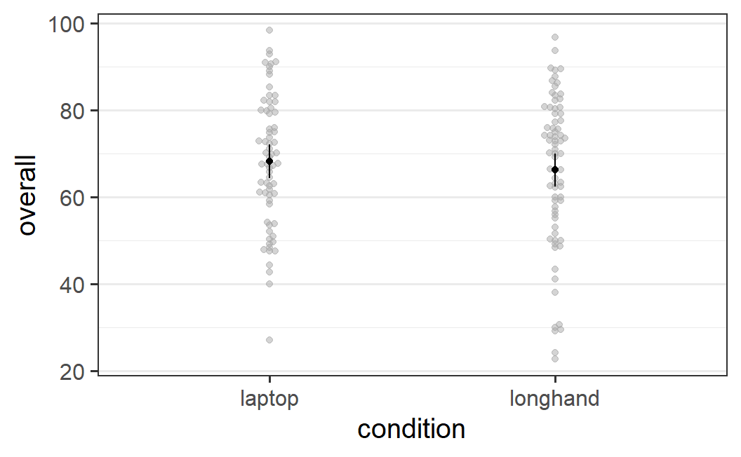
Figure 5.3: afex_plot() figure for data from Urry et al. (2021)
Even without tweaking, this simple call to afex_plot() produces a pretty good-looking figure along the lines of the discussion in Section 4.5. The figure combines the individual-level data points (in the background in grey) with the condition means (in black). Individual data points in the background that have the same or very similar values are displaced on the x-axis so they do not lie on top of each other. This is achieved through the geom_beeswarm geom from package ggbeeswarm. By default, the plot also includes error bars around the mean, which depict the 95% confidence intervals of the means. As we said before, the error bars indicate the uncertainty we have in our estimate of the mean. A full explanation of what a confidence interval shows will be given in a later chapter.
As afex_plot() returns a ggplot2 plot object, we can manipulate the plot to make it even nicer.
p1 <- afex_plot(res1, "condition")
p1 +
  labs(x = "note taking condition", y = "memory performance (0 - 100)") +
  coord_cartesian(ylim = c(0, 100)) +
  geom_line(aes(group = 1))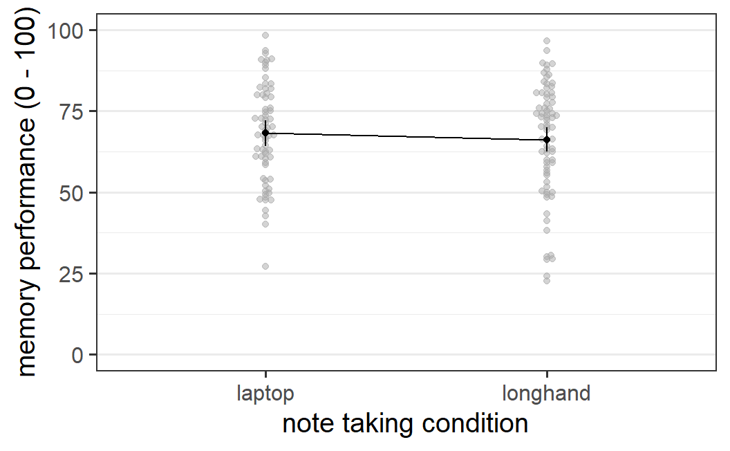
Figure 5.4: Nicer afex_plot() figure for data from Urry et al. (2021)
For example, in the code snippet above, we first save the plot object as p1 and then call a number of ggplot2 functions to modify this plot object to alter its appearance (as discussed before, graphical elements are added to a ggplot2 plot using +). Function labs() is used to change the axis labels, coord_cartesian() changes the extent of the y-axis (i.e., the plot now show the full possible range of memory performance score), and geom_line(aes(group = 1) adds a line connecting the two means. This figure is easily of high enough quality to be included in a results report, dissertation, or manuscript.
5.5.5 Follow-Up Analysis
Another important part of a comprehensive statistical analysis is a follow-up analysis. Follow-up analysis is the catch-all term we will use to describe additional statistical analyses performed after estimating the initial statistical model and inspecting the ANOVA table. Follow-up analysis generally involves the inspection of the predicted condition means and the statistical analysis of their relationships. In the case of a single independent variable with two levels (e.g., laptop versus longhand) there is not much to investigate in this regard! We can nevertheless illustrate the general procedure.
For follow-up analyses, we generally begin with the function emmeans() from package emmeans (Lenth 2021). As for afex_plot(), emmeans() requires an estimated model object as first argument followed by a specification of which factors of the model we are interested in. emmeans() then returns the estimated marginal means, which is a slightly complicated way of saying condition means plus additional statistical information. Let's try this out for the example at hand.
emmeans(res1, "condition")
#>  condition emmean   SE  df lower.CL upper.CL
#>  laptop      68.2 1.99 140     64.3     72.1
#>  longhand    66.2 1.91 140     62.4     70.0
#>
#> Confidence level used: 0.95
For now, we only focus on the estimated means in column emmean and ignore the additional inferential statistical information in columns SE to upper.CL. We can see that the reported means match the means given in the text at the very beginning of the chapter in Section 5.1.
The power of emmeans is not only that it provides the condition means, but it also allows us to perform calculations on the condition means. For example, in the case of a factor with two levels, we can easily calculate the difference between the two condition means. The difference between condition means is also a measure of the size of the effect. However, compared to the ges column in the default output, it is not standardised, but a simple effect size expressed in units of our dependent variable. As it is often easier to understand simple, as opposed to standardised effect sizes, we will generally prefer simple measures.
To calculate the effect of condition through emmeans, we first need to save the object returned by emmeans(). We can then call the pairs() function on this object. This gives us all pairwise comparisons of condition means; that is, the difference among all pairs of condition means. In the present case, there is only one such pair:58
em1 <- emmeans(res1, "condition")
pairs(em1)
#>  contrast          estimate   SE  df t.ratio p.value
#>  laptop - longhand     1.99 2.76 140   0.722  0.4715
The output shows a mean difference of 1.99 which slightly differs from the 2.0 difference reported above in Section 5.1 (i.e., mean laptop = 68.2 - mean longhand = 66.2). This deviation of the model estimates from the descriptive results considered before is slightly concerning. Fortunately, the difference is not real and only a consequence of differences in rounding in the two places. The results reported above are only rounded to one decimal. If we do the same for the model-based results, we also get an estimated difference of 2.0 (we will not explain this code in detail here):
5.6 Summary
The goal of this chapter was to introduce the standard statistical approach for analysing experimental data with one independent variable with two levels – such as an experiment with two conditions. Practically every time when we run such an experiment, we observe that there is some mean difference in the dependent variable between the two conditions. For our example data by Urry et al. (2021), there was a memory difference of 2.0 points between the two note taking conditions (laptop versus longhand) on the response scale from 0 to 100.
The important statistical question we want to address is whether there is any evidence suggesting that that the observed difference in our sample generalises to the population. The sample are the participants in our experiment and the population refers to all possible participants that could have been sampled. For Urry et al. (2021), the population can be loosely described as students taking notes, or more precisely, undergraduate students at research intensive (R1) US universities. The question we would like to get a statistical answer to is: Should we believe that there generally is a memory difference between note taking with a laptop versus longhand? In other words, is there a genuine signal or is the observed difference just noise? To answer this question we need inferential statistics.
The inferential statistical approach we are using is called null hypothesis significance testing or NHST. NHST does not directly address the question of whether there is evidence for a difference in the population. Instead, NHST tests the compatibility of the data with the null hypothesis – the assumption that there is no difference between the conditions in the population. The most important result from a NHST is the \(p\)-value. The \(p\)-value is a measure of the compatibility of the data with the null hypothesis – the probability of obtaining a result at least as extreme as observed, assuming the null hypothesis to be true. If the \(p\)-value is smaller than .05, we reject the null hypothesis that there is no difference. We then behave as if there is evidence for a difference (although this does not follow with logical necessity).
To apply NHST to the data, we set up a statistical model that partitions the observed data into three parts (Equation (5.1)): the intercept representing the overall mean, the effect of the independent variable (i.e., the difference of the condition means from the intercept), and the residuals representing the idiosyncratic aspects not explained by the other parts of the model. The effect of the independent variable is our estimate of the signal and the residuals are used to derive an estimate of the noise in the data. This partitioning allows us to zoom in on the aspect of the data that we are mainly interested in, the effect of our independent variable, the experimental manipulation.
To estimate a statistical model for the data, we use the function aov_car() from the afex package. aov_car() allows us to specify the statistical model using a formula of the form dv ~ iv + Error(pid) (where pid refers to the variable in the data with the participant identifier), resembling the mathematical specification of the statistical model. The default output returns an ANOVA table which provides a null hypothesis significance test for our iv, the independent variable. The returned table is called an ANOVA table because statistical models that only contain factors are called analysis of variance or ANOVA. In the present case, the statistical model only has a single factor, note taking condition, with two levels, laptop versus longhand. In the returned ANOVA table, we not only have the \(p\)-value for our experimental factor, but additional inferential statistical information such as the degrees of freedom, df, and the \(F\)-value.
We can use the object returned from aov_car() for plotting using the function afex_plot(). This function produces a plot combining the individual-level data points with the condition means and error bars indicating the uncertainty of the estimate of the condition means. This provides a comprehensive display of the data of the experiment. As the function returns a ggplot2 object, this plot can be easily modified to create a figure that can be used in a formal report.
We can also use the object returned from aov_car for follow-up analyses using emmeans. With emmeans, we can easily obtain the condition means (or estimated marginal means) of the dependent variable. Based on these condition means, we can calculate the observed effect size (i.e., the mean difference).
Applying the statistical model to the data from Urry et al. (2021) showed a non significant difference, \(F(1, 140) = 0.52\), \(p = .471\). This suggests that there is no difference in memory performance after watching a talk and taking notes with either a laptop or in longhand format.